Introduction
Contents
- 1 Introduction
- 2 Find a purpose for your mental health infographic.
- 3 Choose a topic.
- 4 Decide on a mental health infographic type that best suits your topic.
- 5 Make it visually appealing.
- 6 Write a compelling headline and subheadline.
- 7 Use easy-to-understand statistics or facts.
- 8 Use appropriate images, illustrations, or screenshots to enhance the meaning of your infographic.
- 9 Keep copy concise and easy to read.
- 10 Infographics are a great way to spread knowledge about mental health
- 11 Conclusion
Infographics are fun for everyone—you can create them or find ones you like on the web. If you want your infographic to help people with their mental health, here are some tips for making it effective:

Find a purpose for your mental health infographic.
Your mental health infographic aims to inform people about the importance of mental health and show them how they can improve their own mental well-being.
Once you’ve determined what to include in your infographic, it’s time to put it together. The first step is to write a headline and subheadline. Your headline should be clear and concise, with just enough detail to let readers know what they’re getting into before clicking the link. Try using a question, stat, or anecdote; make sure your graphic is memorable by using metaphors or analogies; include numbers and statistics; use quotes from people who’ve benefited from your content. Or even offer freebies for those who share it on social media.
- Register a Domain Name
Registering a domain name is a fundamental step in establishing an online presence, whether it’s for a personal project, a business, or any other endeavor. - Progressive Mix of World News and Propaganda
- Migrating from GoDaddy Website Builder to WooCommerce
Building an online store with a Website Builder is a great starting point for a new business. - WordPress Security Vulnerabilities and Solutions
Security is a massive topic in the modern world. Mental, physical, emotional, financial, cyber, we all care one way or another about at least one of those. - Perform an SEO Audit for WordPress
You can’t simply build a WordPress website and think you’ll attract traffic and users without having a solid search engine optimization strategy.
A key element of any successful search engine optimization strategy is performing regular SEO audits of your website. - LIEFFIE – Digital News and Development
Choose a topic.
Finally: avoid controversial topics! While some topics may seem like they would lend themselves well to an infographic (such as “Why people commit suicide” or “Why people suffer from depression”), these are often best left alone because they can potentially cause more harm than good by providing false information about sensitive topics that might lead readers down paths which could cause them to harm later on down their lives (e.g., believing someone needs medication when all they need is some support from friends/family). Keep things light-hearted whenever possible–and never forget why we are doing this。
You want to make sure your infographic is easy to read and understand. This means keeping the copy concise, clear, and organized.
Infographics are a great way to spread knowledge about mental health. They’re easy to understand and incredibly flexible in how you can use them.

Decide on a mental health infographic type that best suits your topic.
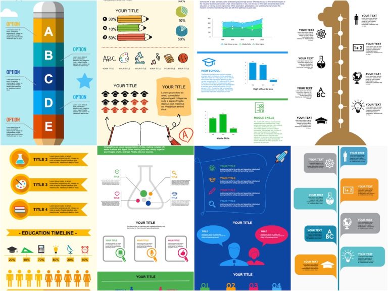
Drawtify Infographic Maker is a free online infographic creator and is constantly updated. Use Drawtify to start creating your customized infographics. And give full play to your creativity. Because you will get a more stunning infographic than the editable infographic template below.
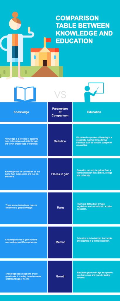
- The comparison infographic (also called a “how-to” or “comparison chart”) is an effective format for comparing two things in the same category and showing the differences between them. This infographic allows you to compare how two things compare with each other quickly.
- The process diagram shows how something works by breaking it down into steps, making it easier for people who don’t understand the process. Process diagrams can also be used as instructional tools, handy when teaching someone new information.
- A timeline infographic shows events over time on one graphic that makes it easy for viewers to follow along without getting lost in all the information being presented at once!
Make it visually appealing.
It should also be aligned with your business goals so that it does not conflict with anything else you are trying to achieve. It would be best if you made sure that the purpose of your infographic is something that people will want and need for them to read it. Otherwise, they won’t take action once they’ve finished reading it.
- Use color. Color is one of the most effective tools for making your data pop. It can also help with legibility and clarity.
- Use images and graphics that enhance the meaning of your infographic. Images can be used to illustrate ideas, make things easier to understand, or provide more context than words alone would allow.
- Have a consistent design style throughout your infographics. Hence, they look like they’re part of a more significant brand identity—this will help strengthen their impact on readers who see multiple infographics from you in one year or month (or week).
- Please keep it clean! A clean layout makes it easy for readers’ eyes to follow what’s happening across the entire infographic without getting distracted by distracting elements like too much text or extraneous factors such as logos or watermarks.
There are many ways to make an infographic visually appealing:

Write a compelling headline and subheadline.
This article offers more tips: 10 Best Infographic ideas to Inspire You — Layout, Topic, Template Design ideas
Use easy-to-understand statistics or facts.
The first step in making a mental health infographic is to choose a topic. The topic should be relevant to your audience, so you must know who will read and interact with the infographic. It would be best if you also chose a topic you’re passionate about, as this will help guide your research process and make the project more enjoyable.
- One in four people will experience a mental health problem at some point.
- People with mental health problems are more likely to be victims of crime than the general population.
- Men are less likely than women to report feeling down or depressed because they believe this is not manly behavior.
Use appropriate images, illustrations, or screenshots to enhance the meaning of your infographic.
- Choose images that are relevant to your infographic’s topic and target audience. For example, if you’re writing an infographic about mental health, it would be best to use images of people with different mental health issues. This can help emphasize the seriousness of these conditions and show how many people are affected daily.
- Use images that help convey the meaning of your infographic more clearly. For example, if you’re writing an infographic about what it means to have depression or anxiety, try using pictures from Google Image Search that show people crying or looking very sad. This helps show what life with these conditions can feel like for someone suffering daily.
Keep copy concise and easy to read.
Infographics are a great way to spread knowledge about mental health, but which one is right for you? There are three main types of infographics:
- Use short sentences and paragraphs.
- Bullet points are great for breaking up large chunks of text. Here are some tips:
- Subheadings help break up the information into smaller pieces that will be easier for the reader to digest. They also give them something specific to look forward to when they get lost in a page full of text!
- Adding white space around images makes them stand out more prominently (and makes it easier for people who have trouble focusing on small details).

Infographics are a great way to spread knowledge about mental health
Here are some statistics that you can use:
Mental health is an important topic for everyone, but it can be challenging to understand. Infographics are a great way to explain complex topics in simple terms. They’re also a great way to get people interested in your cause. Follow these steps to create an infographic that will spread knowledge about mental health, teach people how they can help their friends with mental illness, and inspire conversation on this important issue:
Conclusion
The next step is choosing an appropriate scope for your mental health infographic, determining whether it should focus on one aspect of mental health or cover multiple elements in greater detail. It’s important not to go too broad or too narrow; if you’re covering too much information in one image, there won’t be enough room for any meaningful analysis or perspective; but going too thin may create confusion among those who don’t have prior knowledge of the subject matter at hand!
We hope these tips have helped you get started on your mental health infographic. Remember to keep in mind the purpose of your infographic and choose a topic that interests you. Then, start putting pen to paper (or fingers to keyboard) so that we can all spread knowledge about mental health!
Watch Drawtify Youtube Channel to get more ideas.
