Web Services vs Web Applications
The distinction between “web services” and “web applications” is sometimes blurred in today’s digital environment because…

The distinction between “web services” and “web applications” is sometimes blurred in today’s digital environment because…

In fact, Paul’s neighbour is even in the film. He features in a scene when the…
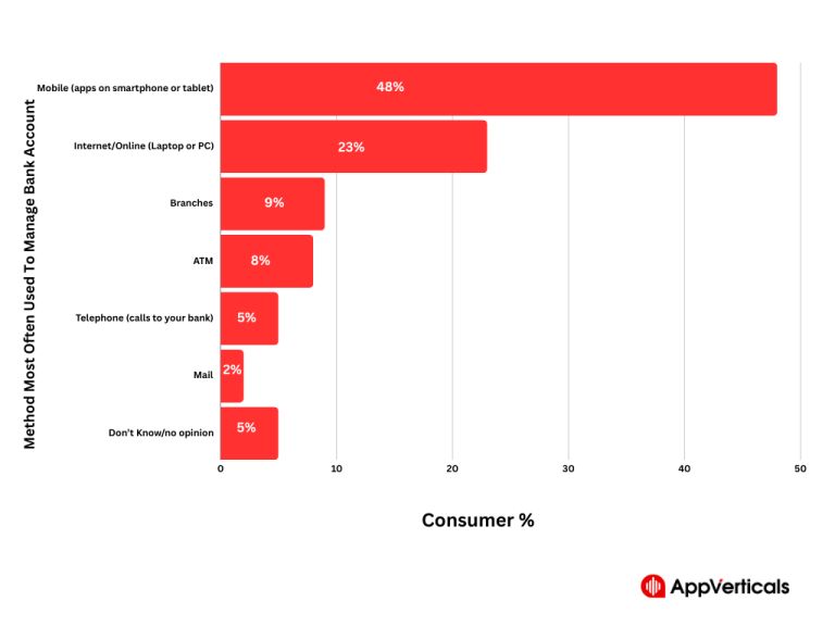
Table of Contents Have you heard the term digital transformation in banking before? Let me clear the concept…
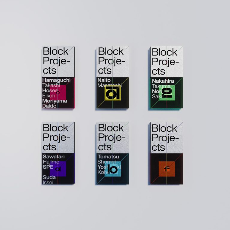
For more information make sure to check out YuJian Huang on Behance. Explore the Block Exhibition by…
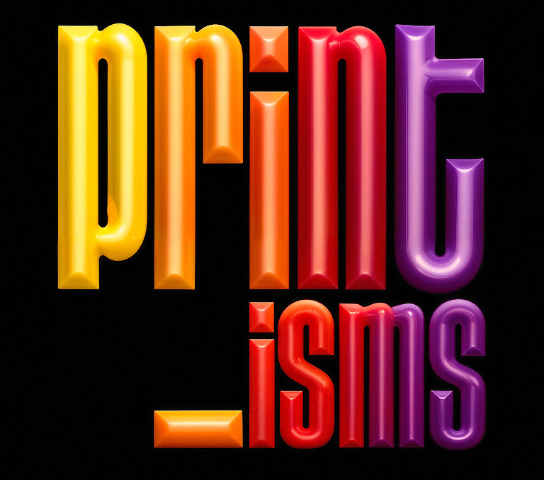
In conclusion, “-Isms” by Katt Phatt™ Studio is a groundbreaking project that redefines the boundaries of…
It’s been four years since the digital collaboration platform Miro (then RealtimeBoard) rebranded with Dutch design…

The 59th Quarterly Edition from Field Notes titled “Foiled Again,” showcases a revered printing technique. Over…
Lately, in a bid to engage more directly with tactile creation, Dominique has been converting her…
Graphic designer, artist, and educator John Provencher is making waves in the New York design scene….
For more information make sure to check out João Corrêa Behance profile.In the bustling world of…
For more information make sure to check out Jose Manuel Vega on Behance. Jose Manuel Vega’s recent…
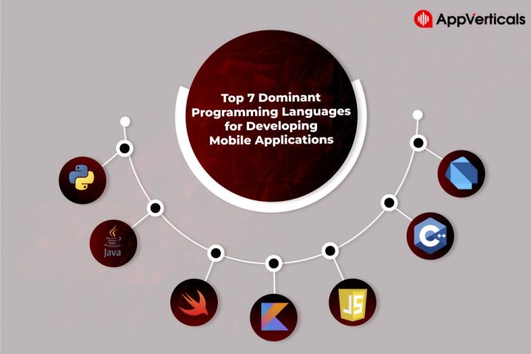
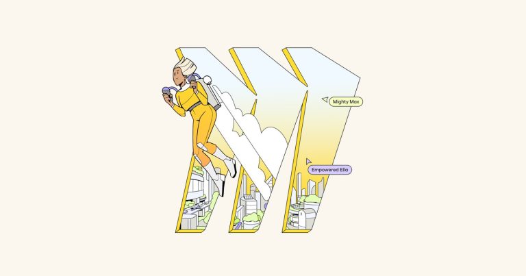
Mobile applications have become an integral part of our lives. We have a mobile app for…
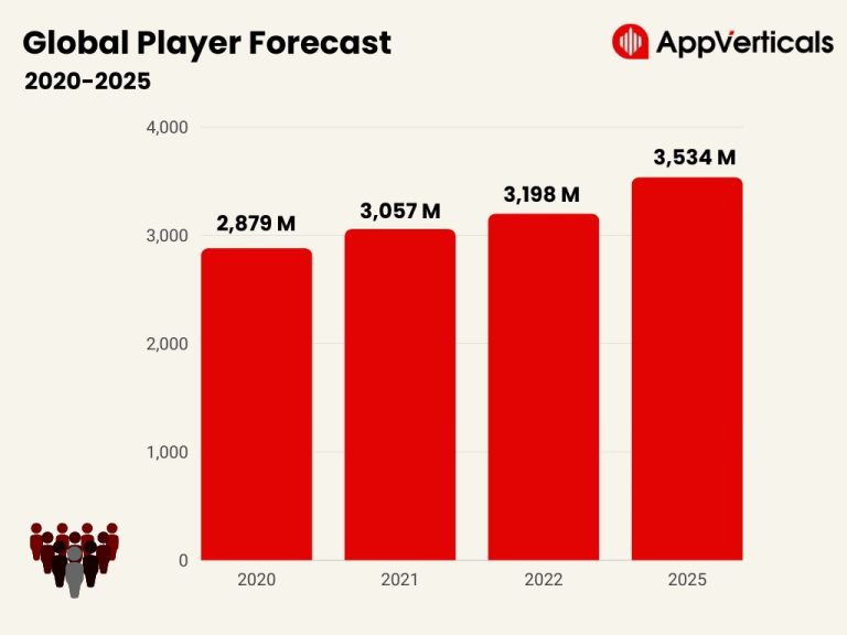
In the dynamic landscape of digital entertainment, mobile games have emerged as a powerful and engaging…