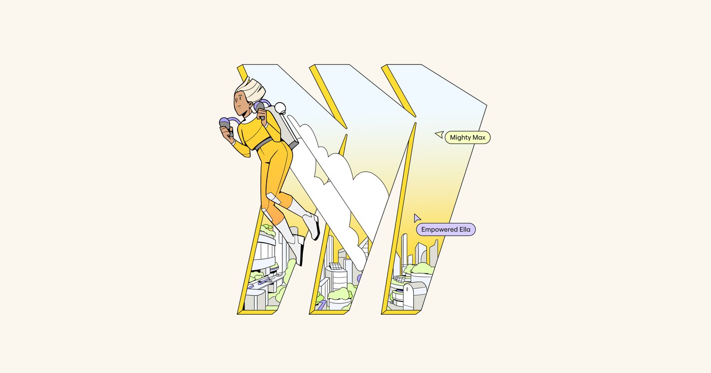
It’s been four years since the digital collaboration platform Miro (then RealtimeBoard) rebranded with Dutch design agency Vruchtvlees, with the aim of becoming known as more than just an online whiteboard. The move paid off; in a short time, the start-up has established itself as a leader in the field of workplace tools, now working with AKQA to evolve its brand identity further.Elsewhere, an updated logo acts as a portal where users can see ideas brought to life. “Whether in a static form or brought to life through motion, the logo is crafted to emulate those peak instances when inspiration strikes, offering a window to the future through the stylised ‘M’ of Miro,” says AKQA in a press release.Perhaps the most noticeable change is the new illustration style, which AKQA hopes will add a layer of “dynamism” to the brand. The updated character design is less abstract and more dimensional, allowing Miro to focus on building narratives through its assets – a major focus of the project. In particular, AKQA is telling stories of design innovations and near-future advancements in tech, such as “the ambition of robots replanting the Amazon” or “autonomous transportation solutions”, to emphasise the limitless potential of working with Miro.
