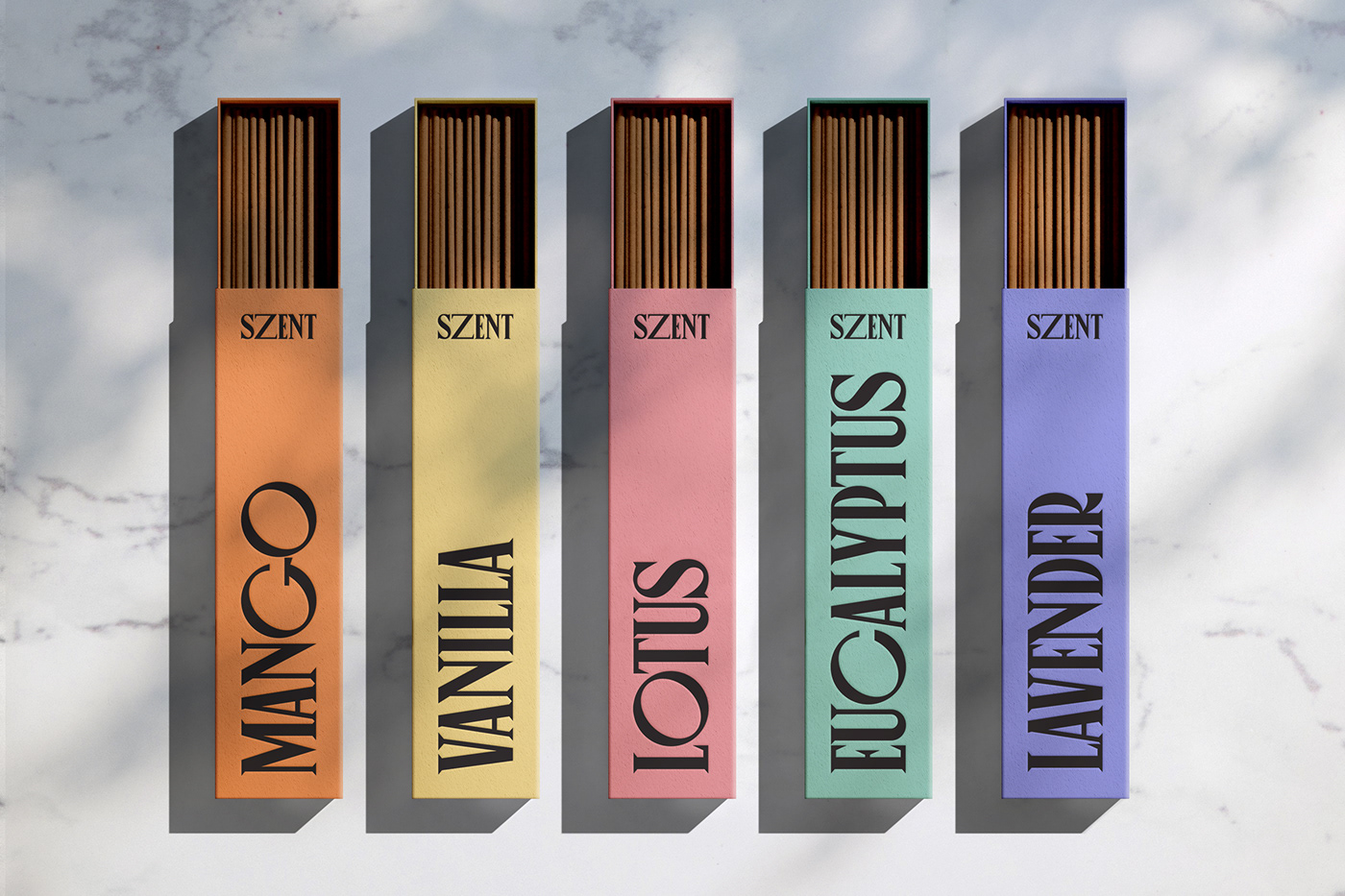

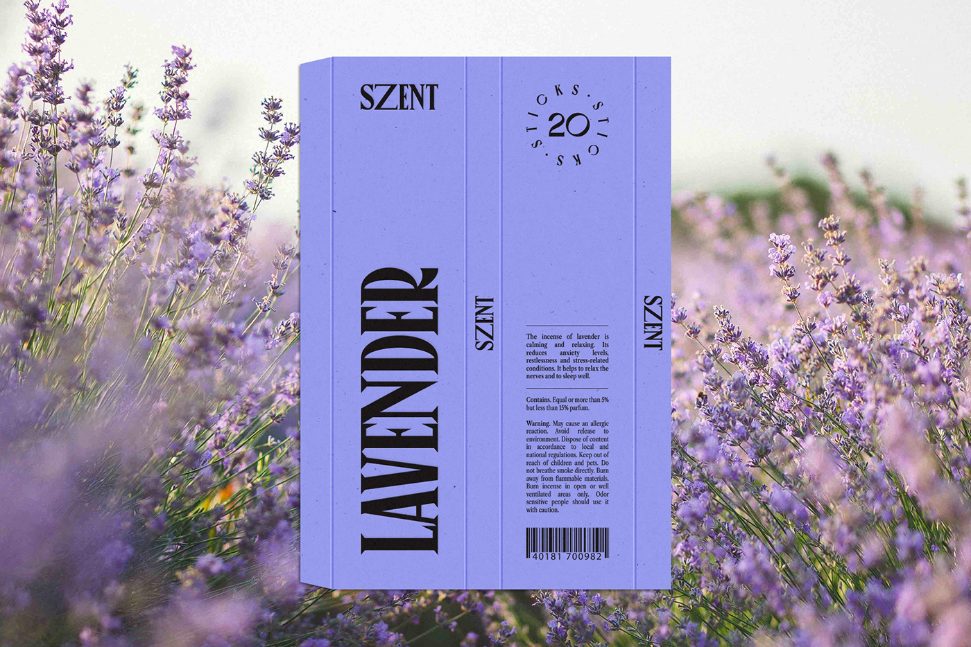
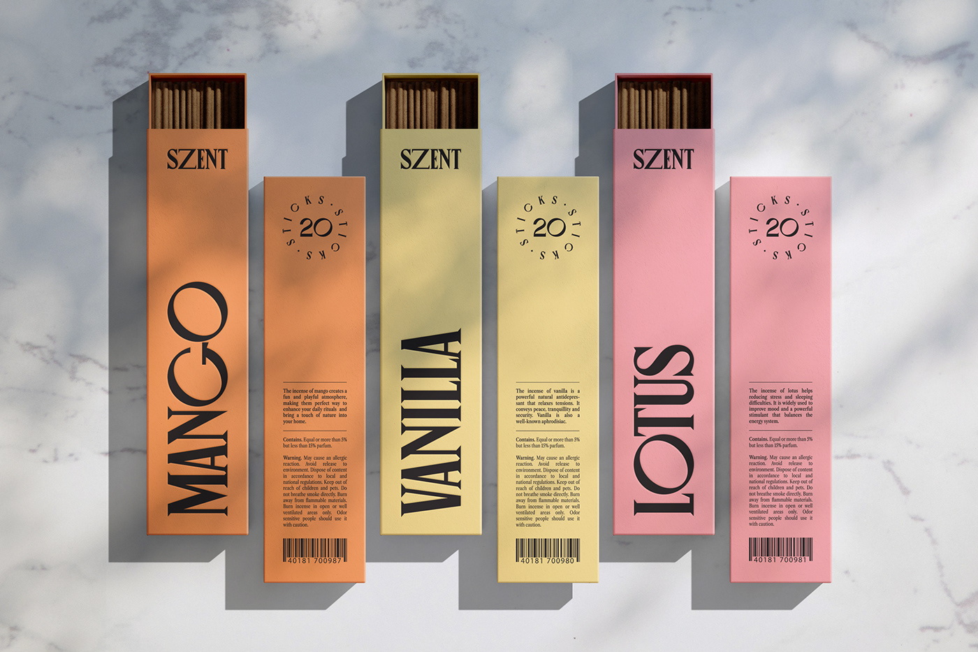
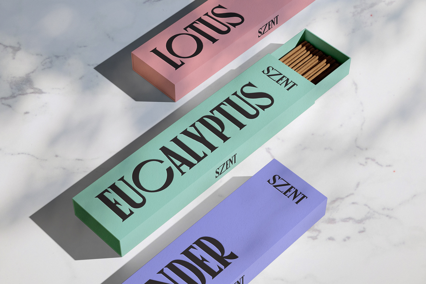
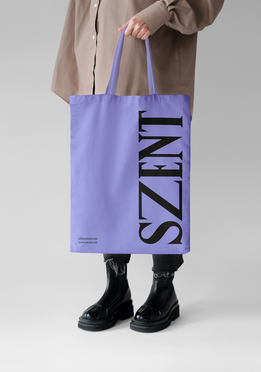
Jose Manuel Vega’s recent endeavor for SZENT. This premium incense brand concept flaunts a minimalist yet luxurious design, proving that sometimes less truly is more.
For those keen on cutting-edge branding, Vega’s work with SZENT stands as a testament to the power of minimalist design in an era where subtlety and humor can make a brand truly memorable. The world awaits, with bated breath, for his next masterstroke in the realm of branding.
- How to build a website with WordPress and what are the best plugins to use Building a website with WordPress is an excellent choice due to its versatility, ease of use, and a vast array of plugins that enhance functionality. Here’s a comprehensive guide to building a WordPress website, along with recommendations for the best plugins
- Top WordPress Plugins for Managing Ads and Monetizing Your Website Effectively: Why is Ads Management Important for Website Monetization? Strategic ad placement throughout the website enables publishers to maximize ad revenue while ensuring a positive user experience. The positioning of ads is critical in capturing users’ attention without being intrusive or disruptive. By understanding user behavior and preferences, publishers can make informed decisions regarding ad placement to ensure that the ads are relevant and engaging.
- Top Directory Plugins for WordPress to Create Professional Listings and Directories: If you are interested in establishing professional listings and directories on your WordPress website, the following information will be of value to you. This article will present the top directory plugins available for WordPress, which include GeoDirectory, Business Directory Plugin, Sabai Directory, Connections Business Directory, and Advanced Classifieds & Directory Pro.
- The Most Important Stages and Plugins for WordPress Website Development: Developing a WordPress website requires careful planning, execution, and optimisation to ensure it is functional, user-friendly, and effective. The process can be broken into key stages, and each stage benefits from specific plugins to enhance functionality and performance. Here’s a detailed guide to the most important stages of WordPress website development and the essential plugins for each stage.
- .org vs .com: A Top Guide to the Differences in Domain Extension
When you set up a website for a business or a non-profit organisation, you might think the most important part of the address is the actual name. But the domain extension (the bit that comes after the dot) is just as important for telling people what your site is all about. - The Best WordPress Plugins for Image Optimization to Improve Load Times and SEO. The pivotal element lies in image optimization. This discourse delves into the significance of image optimization for websites and its impact on load times. Furthermore, we will delve into the advantages of leveraging WordPress plugins for image optimization, such as streamlined optimization processes, enhanced SEO, expedited load times, and an enriched user experience.
- What is a data center or Internet data center? The term “data center” has become very common due to the role it plays in many of our daily activities. Most of the data we receive and send through our mobile phones, tablets and computers ends up stored in these data centers — which many people refer to as “the Cloud”, in a more generic way.
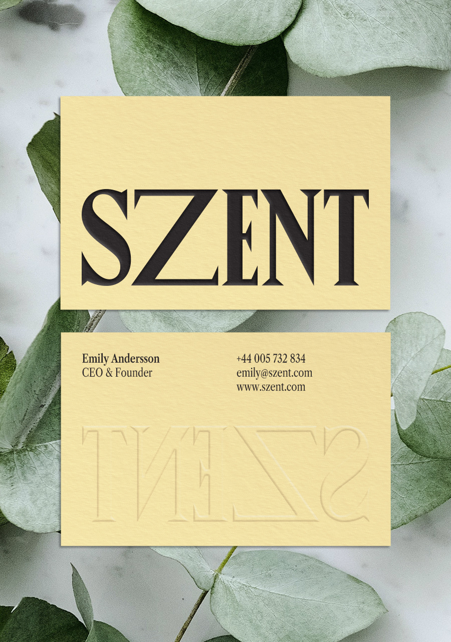
Dig a little deeper into the brand name, and you’ll uncover the genius behind Vega’s subtle humor. ‘SZENT’ is a clever amalgamation of ‘scent’ and ‘zen’. Not only does the name evoke feelings of tranquility and aroma, but its visual representation is equally thoughtful. The brand’s wordmark brandishes an extended ‘Z’. This elongated design is reminiscent of an incense stick, gracefully tilted on its holder, further enhancing the brand’s association with serenity and calm.
Branding and packaging design
With this project, Jose Manuel Vega proves that branding isn’t just about being seen; it’s about making a lasting impression. SZENT’s minimalist design and tongue-in-cheek brand name exhibit the designer’s keen sense of aesthetics combined with a whisper of wit.
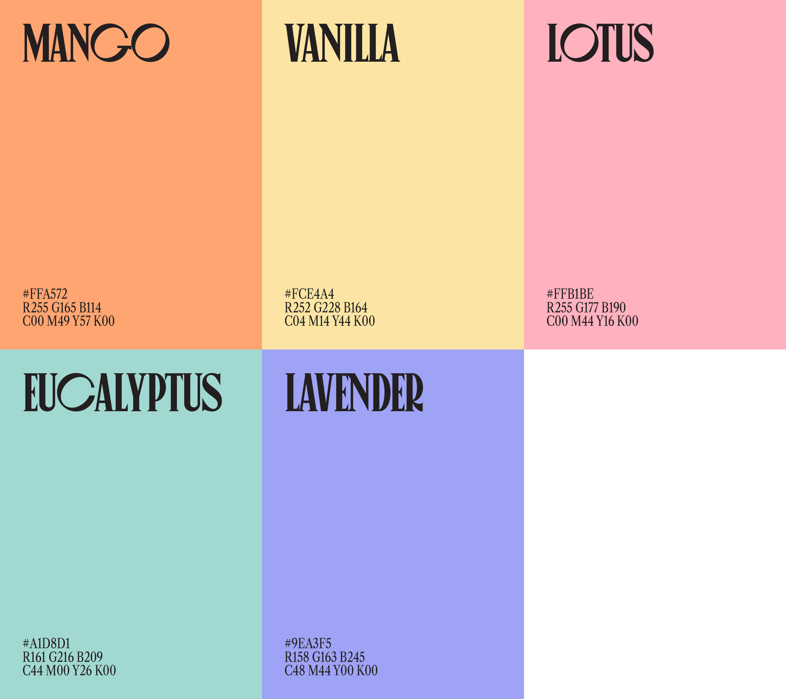
SZENT’s design takes a refreshing detour from the ornate staples of the incense industry. Instead, Vega masterfully marries typography and a delicate color palette of soft pastels. The result? A visual identity that’s not just elegant, but also a distinct head-turner on crowded shelves.
