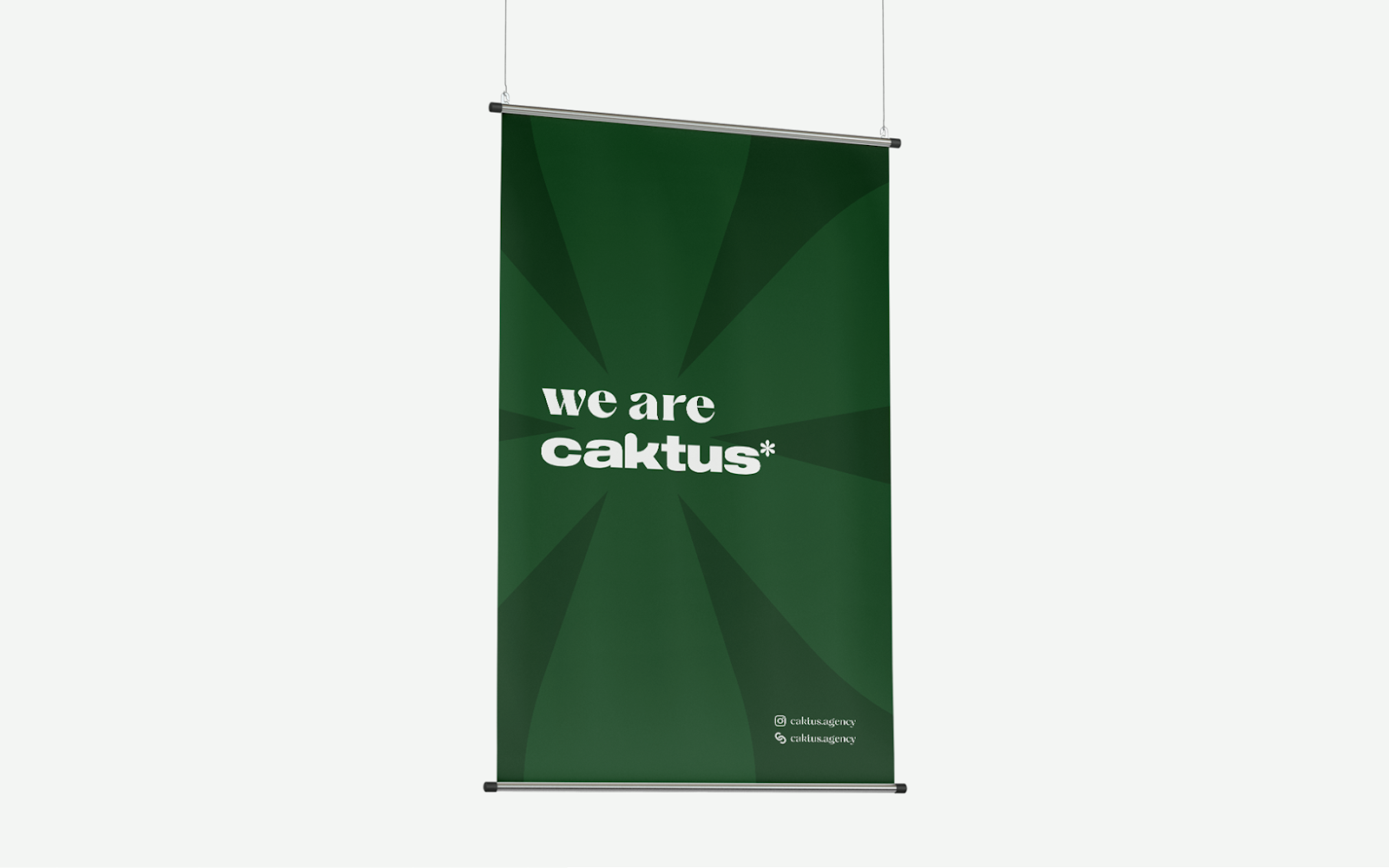
For more information make sure to check out João Corrêa Behance profile.In the bustling world of branding, names like João Corrêa rise above the crowd, injecting subtle humor and minimalist magic into every design venture. Caktus Agency, a powerhouse driven by an all-female team, recently unveiled their new brand identity. And the mind behind it? None other than João Corrêa, with support in creative direction from Julia Martins.
In conclusion, Caktus Agency’s new brand identity, crafted meticulously by João Corrêa, is not just a visual treat but a testament to how branding can truly encapsulate a company’s soul. It’s a reminder that in the world of {branding}, contrasts can coexist, creating a narrative that is both compelling and authentic.
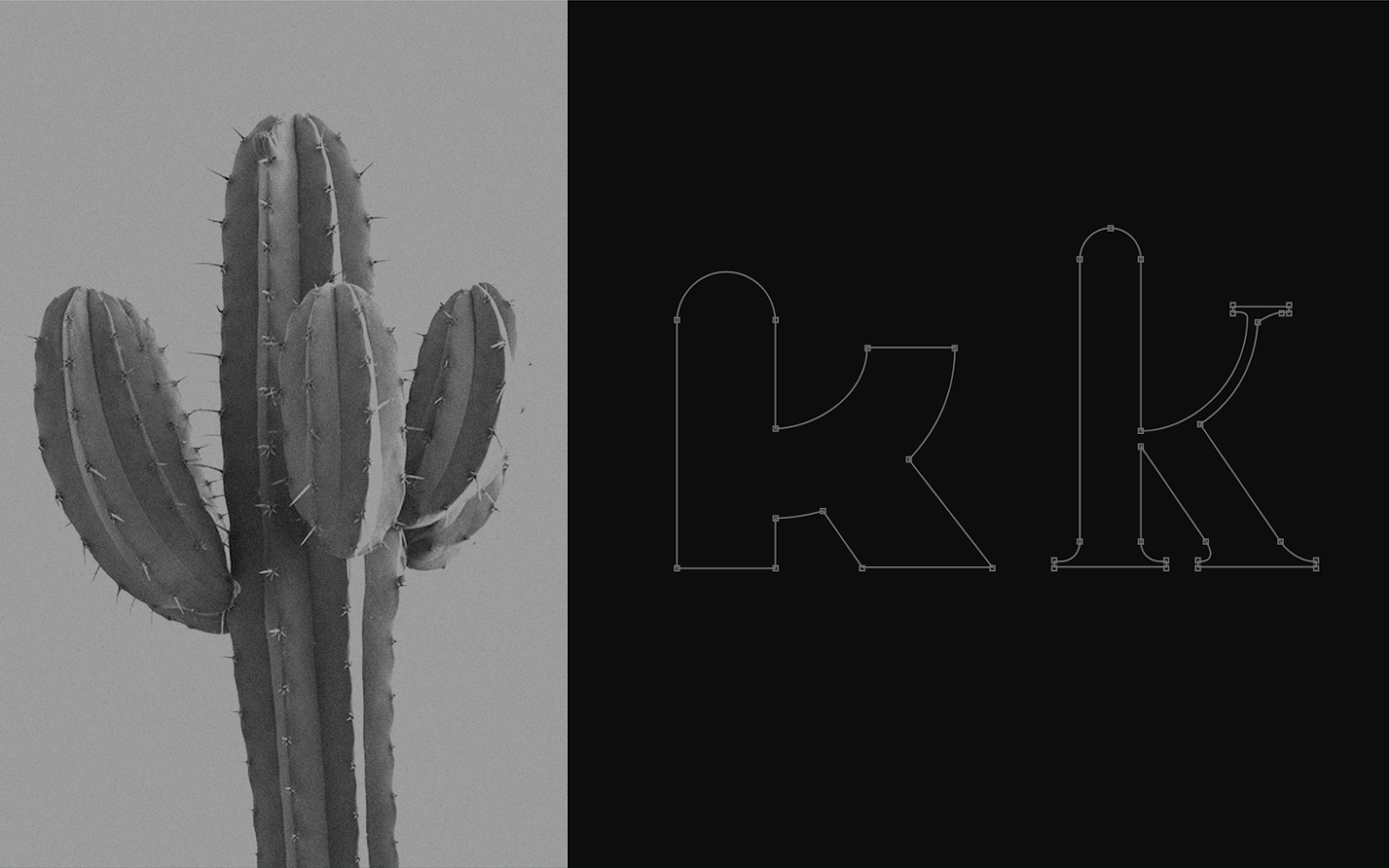
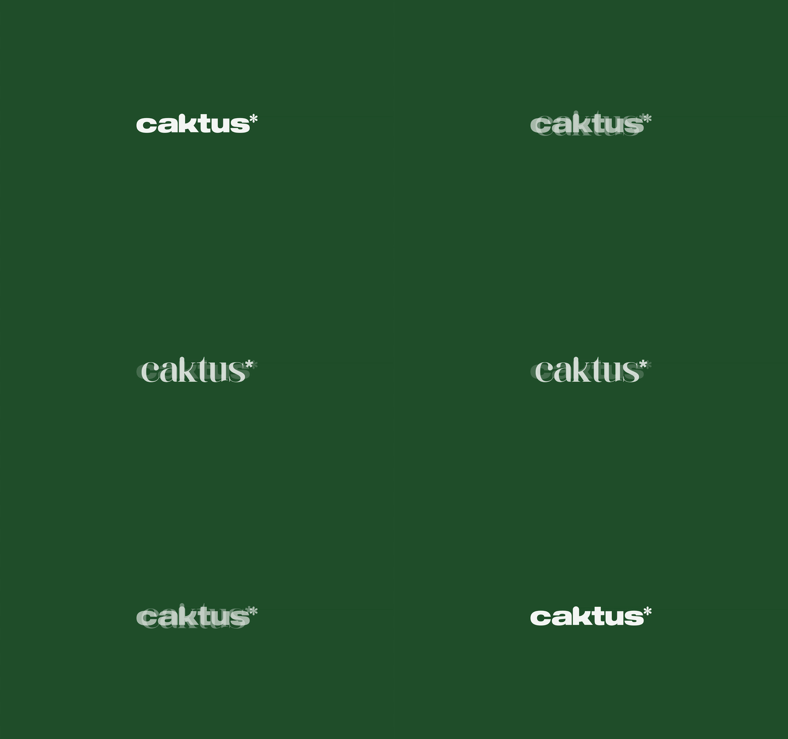
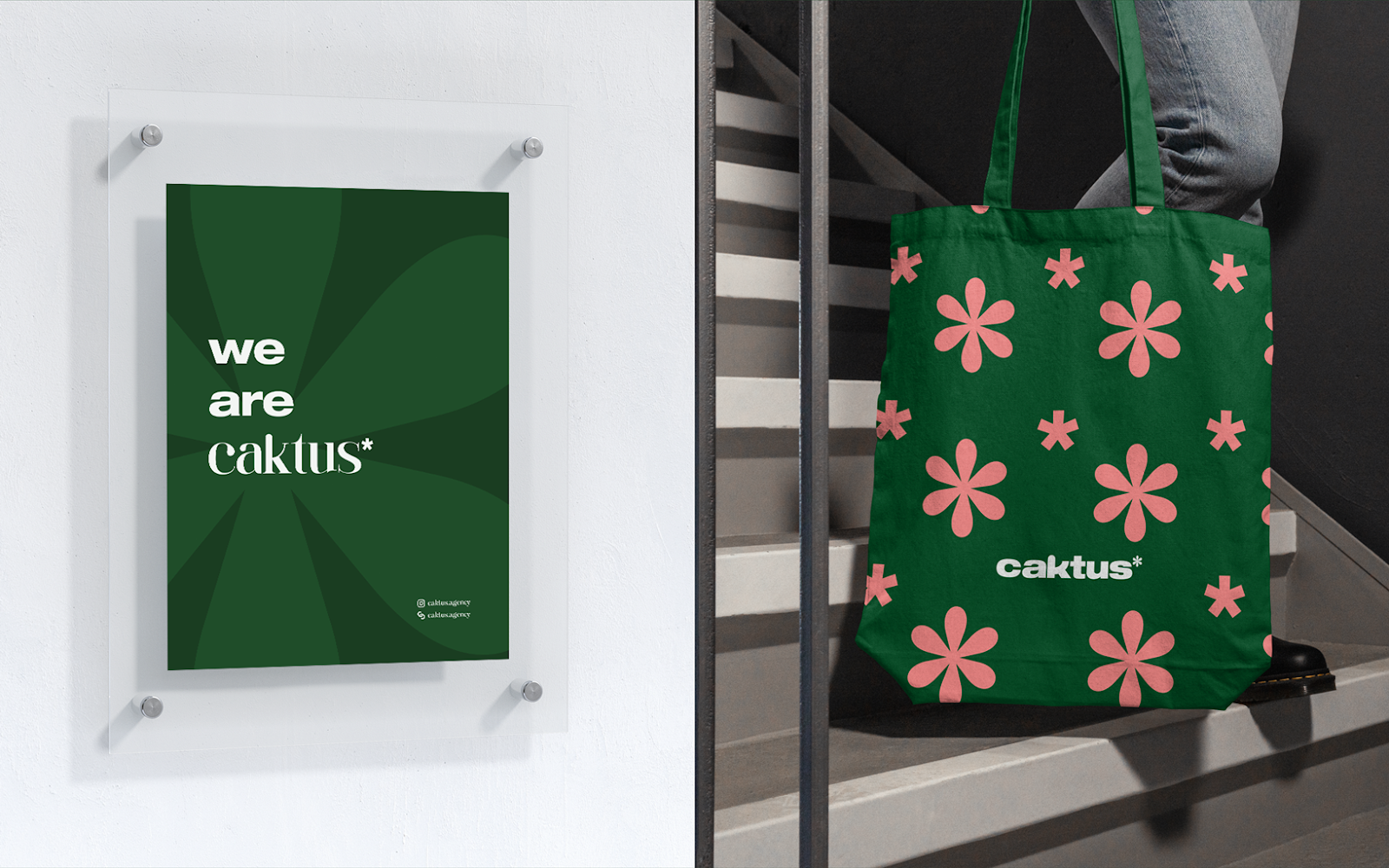
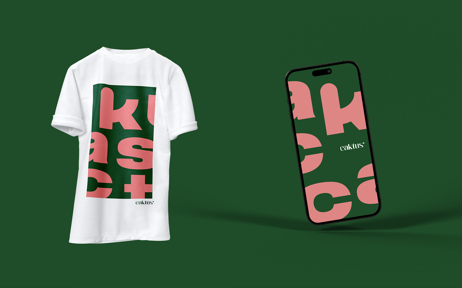
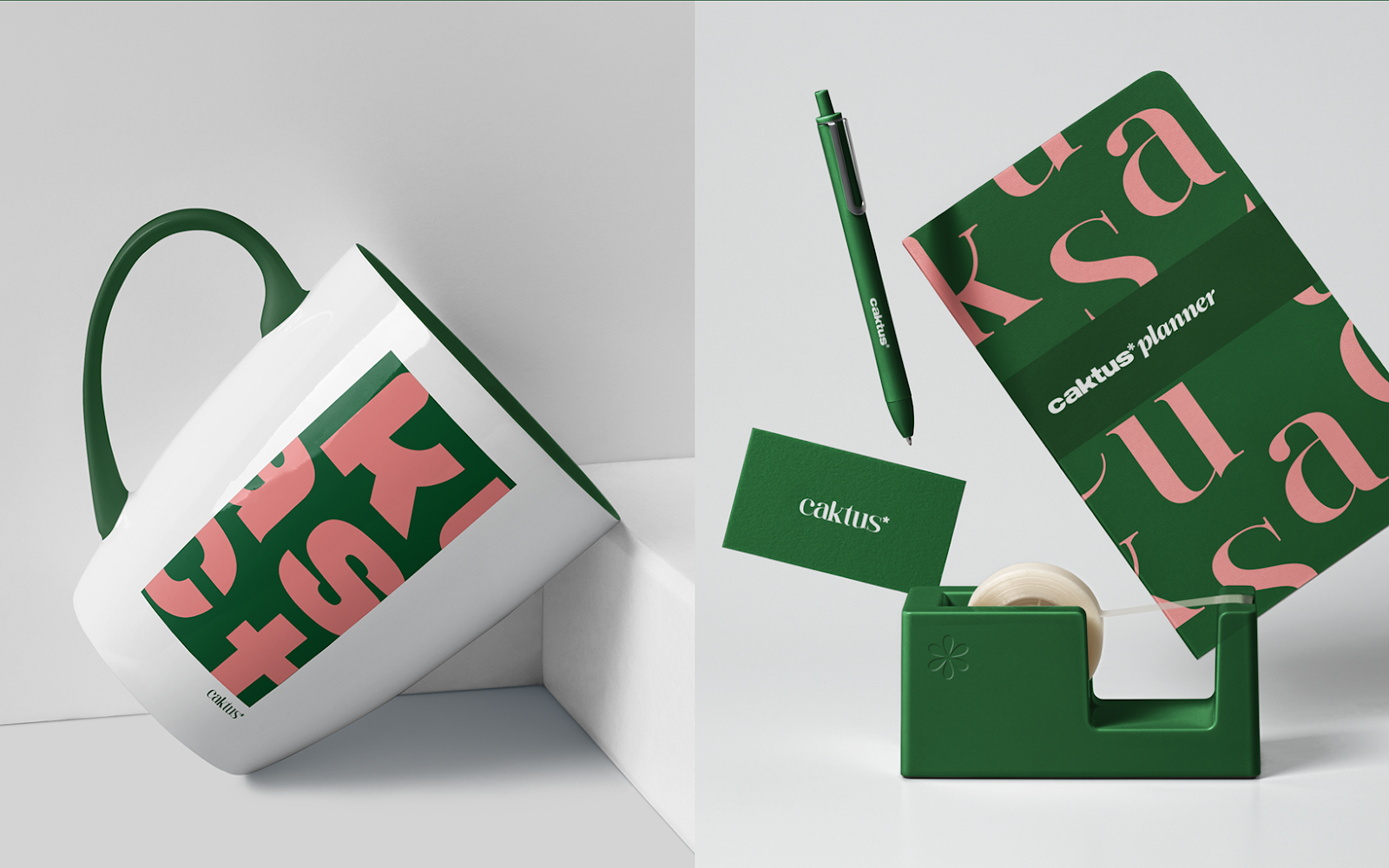
Enter João Corrêa. His solution was brilliantly simple yet deep – embrace the contrasts. Steering clear from traditional branding norms, João centered the identity around this concept. The resultant logo, mirroring the essence of Caktus, came in two variations, each telling a different part of the Caktus story.
- The Best WordPress Page Builder Plugins for Creating Stunning and Customizable Layouts: If you are seeking to improve the appearance of your WordPress site with visually appealing and customizable layouts, page builder plugins offer a valuable solution. This article aims to delve into the concept of WordPress page builder plugins, outlining the reasons for their utility, and presenting a selection of top-rated options such as Elementor, Beaver Builder, Divi Builder, Visual Composer, and Thrive Architect.
- A Basic Guide to Designing a Multilingual Website: Whether your goal is to generate significant revenue or to establish a robust international community, it’s crucial to consider several design elements from the outset. These elements will ensure your website is versatile and can be easily adapted to meet various international standards. Creating foreign-language versions of your site involves more than simple translation; proper localization is necessary before your launch, and early planning can significantly simplify this process.
- 5 Different Types of Shell Commands in Linux: When it comes to gaining absolute control over your Linux system, then nothing comes close to the command line interface (CLI). In order to become a Linux power user, one must understand the different types of shell commands and the appropriate ways of using them from the terminal. In Linux, there are several types of commands, and for a new Linux user, knowing the meaning of different commands enables efficient and precise usage. Therefore, in this article, we shall walk through the various classifications of shell commands in Linux.
- Bare Metal as a Service: Direct access to physical servers: In the evolving landscape of cloud computing, businesses are continually seeking more robust and customisable solutions to meet their unique needs. One such solution that has gained prominence is Bare Metal as a Service (BMaaS). This model offers direct access to physical servers, providing enhanced performance, security, and flexibility. Let’s delve deeper into what BMaaS is and why it might be the right choice for your organisation.
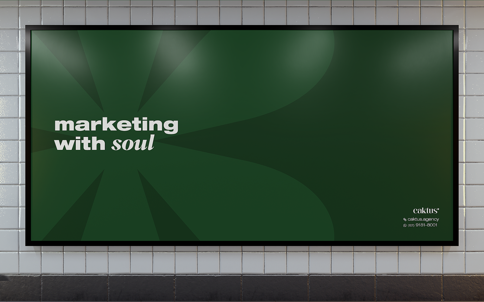
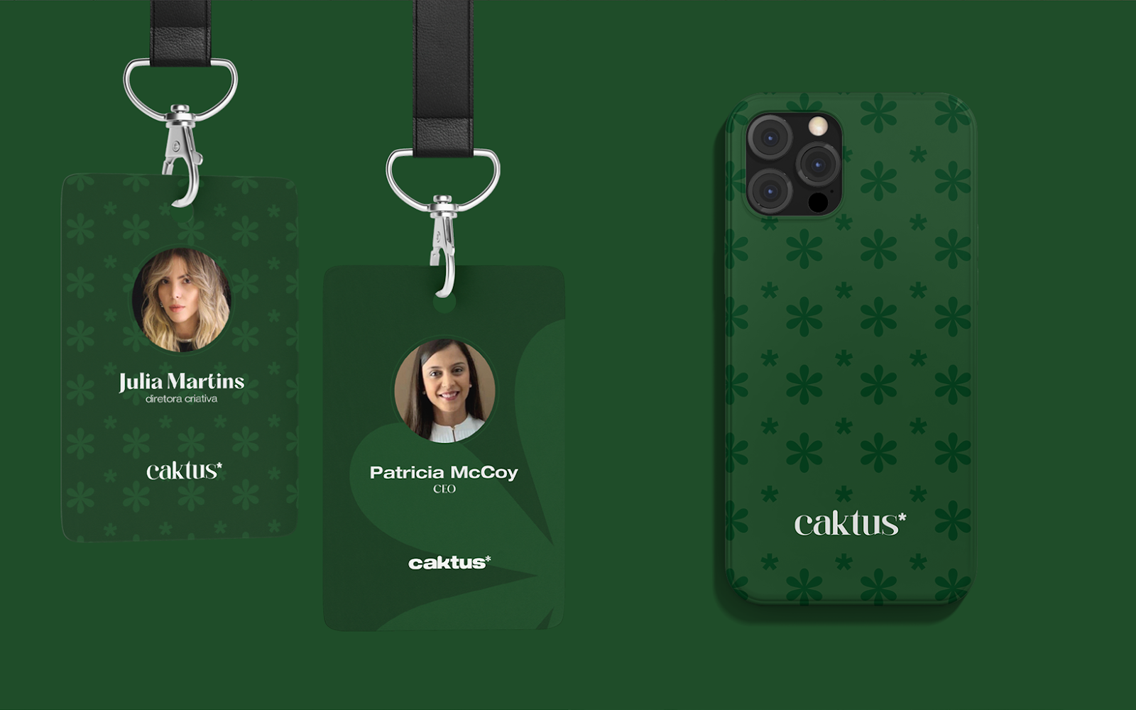
Branding and visual identity artifacts
Despite the seasoned professionals under its banner, Caktus Agency’s brand had to radiate not just experience but also novelty. Conveying expertise, especially given the company’s recent inception, was a challenge. The essence of contrast – from new to established, from strength to softness – needed pictorial representation.
Caktus is not just an agency; it’s a narrative. It embodies the strength and grace of every woman in its team. From Brazil to the US, its founder has touched many horizons, aiming to build an identity that resonates with both markets. A brand that is as solid as it is delicate, Caktus required a visual narrative that matched its ethos.
